Monday, November 22, 2010

Picture Window Dark

I picked the dark theme of the Picture Window Template.

Transparent text header images work again.
YAY!
However, Blogger is automatically stretching the image.
The transparent text still looks okay, so I'll leave it alone.

However, I tried an old header image with text and the automatic stretch made the image and text blurry. Yuk. I couldn't figure out how to display it at its original size. I've used an old header image before and it worked okay. So this is a new glitch. The header image sizes I tried were 740x150 and 560x150. Both were stretched bigger and looked blurry. I think I tried a different height as well and that didn't work either.

Tried using my own background image, which is a new feature (9 Sep 10) in Template Designer and that worked just fine. The option is under Background. After you upload your image, then you get the options for tiling and alignment. The image is stored in your Blogger Picasa account. So it can be deleted later if desired.

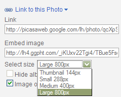
Screenshots and image samples:

Seamless tile I made. (Free to snag if anybody wants it.)


Screenshot:


I also like this space image in the Science category of background images available in Designer Template and decided to use that on my main blog.


Had to add blockquote coding again and changed the colors to a dark purple.
Code and info is here.

colors I used:
border:#67228a
background: #411757

Screenshot:

Thursday, September 23, 2010

Simple Taupe

Screenshot:


Since transparent Header images no longer work in Blogger (happened around 14 Sep 10), I was trying out different Headers and playing with the gold, taupe color scheme idea. Ended up tweaking a Simple Template.


My header image is the light taupe part (560x150px). Blogger stretches the image taller, no matter what size I make it. Grrrr... The rust colored part is the Header background color. A happy accident.

Gotta get rid of that pesky image border again.


With this template, you do have color choices for the image border, but you can't get rid of it from within Template Designer. You have to tweak the above code in the Html section.

I like the divider at the end of each post. I made it a little thicker (3px).
That's a Footer Border in the Html section, but called a Shadow within Template Designer.


Wednesday, September 22, 2010

Picture Window Gold Pattern

Tweaked my template again.
How about gold, taupe, black, white

Transparent Header images no longer work in Blogger, so I went back to a plain text Header until that gets fixed.

Here's a screenshot (Laptop):


Border code:
dotted black on bottom of post and solid black on top of post.


Pattern:

Sunday, September 05, 2010

Picture Window - Bottom Border Divider

I add a bottom-border divider to Picture Window Template.

Can change it to desired color via Template Designer, Advanced, Post, Border Color.

Border Screenshot:


Code screenshot:(Edit HTML area of Blogger.)

Picture Window Autumn

Same Picture Window Template.
Add autumn leaves background for the obvious choice autumn template.

I bought a Laptop, so now I get a 14" 16:9 screen view and the 17" 4:3 screen view of my old monitor.

Laptop View Screenshot:


The image:


Other autumn leaves background images:


Thursday, August 05, 2010

Picture Window Sunrise

I've been hungry for orange lately.
Decided to fiddle with Blogger Templates again and see what I could come up with in the color orange that's "naturey."

Used my same Picture Window Template with the serene Mountain scene.
Changed the background image (Nature category) and used the suggested text colors.
Had to change the Post Border color and Post Background color to transparent (Advanced Section).


It was a little tricky getting the header text to be readable yet blend in.
I came up with a gradient for text on transparent png image.


Added one of my bird pics (70% opacity) on my transparent bg name avatar.
Not sure how I like it.

Here's the screenshot result of my template now:

Thursday, July 08, 2010

Back To Picture Window Template

Back to Picture Window Template. LOL
I got on the minimalistic idea with that gray Awesome Template (previous post), but found I like the transparency of the Picture Window Template rather than the boxy look of the Awesome Template.

I found a nice serene soft mountain background under the nature category.


I did have to set the posting area to semi-transparent so the background would show thru that area. I also got rid of the borders. The right column is semi-transparent by default.

Then I fiddled with a header title, which turned out to be a selection with a soft drop shadow in Paint Shop Pro 9. Got rid of the splashy purple flower avatar by profile area and added my name in a fancy font but soft dark gray.

I'll sit with that for awhile.

Tuesday, July 06, 2010

Awesome Templates

I'm going to try out the Awesome Templates next.


It looks like it uses different bordering effects for each section.
I really like this plain grey one with the soft shadowing around the section edges.

Screenshot:


I wonder what it looks like in IE8. Will test. (It was a tad different, but okay.)

I'm using the same Header, which is just a transparent text png file.

Turned out that I didn't find much I could do with the template that I liked. Maybe I'm tired of the boxy columns/elements look because I had that on my old template. About the only background I liked with this gray theme was a gray bokeh under the abstract backgrounds section.


I could have tried making a gray texture tile as background, but decided I just didn't want to fiddle with it anymore.

Tuesday, June 29, 2010

Watermark Template

Trying out the Watermark Template.
Surprise.
It adds a white border and drop shadow to images.
Which looks kind of nice, BUT I don't think I'd want that on ALL my images.


(Did a screenshot of border so I'll still show it when I change the template.)

So I'm sitting here struggling with how to turn the darn thing off.
Looked in the html code, not readily apparent to me there.
Tried an inline img style, that didn't work either.
Hmmm.

Turn Off Border/Drop Shadow on Images
Figured it out.
The "border" is white colored padding with box-shadow coding.
The following inline image styling worked to shut off the "border":
<img style="background: none; -moz-box-shadow: none" alt="" src="http://etc" />

Testing Shadow Off:


NOTES:
I found the coding under the Widgets section of the Template (look for .post-body img).
I did not change the padding, just turned off the color and shadow coding. Would need to test text flow around image to see if padding needed adjustment too.
The drop-shadow does not work correctly in IE8. It's a "shadow" on ALL sides, not two sides.

Reference Links:
w3.org box-shadow
css-tricks
mozilla box-shadow

Testing Shadow On via inline coding:


Inline Code Used:
<img style="background: #fff; -moz-box-shadow: 1px 1px 5px rgba(0, 0, 0, .5); -webkit-box-shadow: 1px 1px 5px rgba(0, 0, 0, .5); -goog-ms-box-shadow: 1px 1px 5px rgba(0, 0, 0, .5); box-shadow: 1px 1px 5px rgba(0, 0, 0, .5);" alt="" src="http://etc" />

Shadow Off via changes to template:

All I did was to make that part of the code a comment (highlighted in yellow).
That way I still had the code there if I wanted to turn it back on.

Further notes on the Watermark Template:

I changed the colors to purple.
Fiddled with other colors.
Tried Courier font at 18px bold.
Created transparent text header.

Background Images
I like the birds on the background.
I haven't figured out how the background texture works yet. It looks like a repeated grainy textured overlay (or semi-transparent?)*.png image maybe. Then the birds *.png is some kind of overlay displayed once top right.


What the heck is the "Tabs" section of the template for? I don't notice anything when I fiddle with that section.


I think this might be the new static stand-along pages feature?
See Blogger Help post.
I haven't used that yet, but I think it looks like Tabs at the top of your blog.

Pink Themes

Continuing with the pink theme.
A few different backgrounds.
Same semi-transparent white header image I created.


Thursday, June 24, 2010

Picture Window Paper Texture Header

I made my own header image and like that better than using the one from the template.
I tested three different kinds and decided I like the semi-transparent white version the best.

Here are examples of what the three versions look like when applied to this template:


NOTE: Font is TraftonScript.

Wednesday, June 23, 2010

Picture Window Paper Texture

I like the Picture Window Template because of that semi-transparent sidebar.


I selected the single column right sidebar layout.
This would give me a wider post area for bigger photo postings if so desired.

I selected a texture and color.


Made the posting background, header background and text the color pink.
If I find a color I like when I'm fiddling around, I do a screenshot of it so I don't lose the color.


I like the Watermark Template too, but that's more limited because the sidebar is totally transparent and you can't read the text very well if you use a different background. I'll post an example of that too eventually.

Tuesday, June 22, 2010

Travel Template


I like the Travel Template.

I chose the default, but there are four choices under the Travel Template and they are quite different.


Background Image on default:


What it looks like on my blog.

The only change I made was the font size and type to Georgia.

My previous layout was used, but can easily change that too:


The next image demonstrates how the colors of each element can be changed.
I don't understand the color layering.
The "green" color is actually a bright green, but displays muted.
So it seems to be a transparent color over something.
With the live preview, you can see instantly what it will look like.
If you were wanting a specific color, it might be a little difficult to get it, though.


Overall, I'm really impressed by how flexible these new templates are.
It is fun to fiddle around with them.
That is why I might be changing my template often for a while, until the novelty wears off maybe.

Monday, June 21, 2010

My First Template


My first template I made with Template Designer and the one I'm currently using on my main blog. I really like it.
It is the Picture Window Template with double column right sidebar layout.
I selected a different background in the Nature category.
Added my own header image.
Fiddled with the other element colors.

My Own Image Background goes with this template.

Friday, June 18, 2010

New Editor under Settings Basic Tab

Updated the Editor under Settings, Basic.
What is up with automatically inserting nbsp code all over the place in my posts?
Irritating.
I'll have to read up on the new editor.
I didn't know it was going to tweak my posts without notifying me first.
I might go back to the old editor until I'm more informed.

Info

My Own Image Background

Template Background

This background goes with my first template.

I'm going to try other templates, so click above link for 1600x size.

Here's how I made the background.
New image size 1024x768.
Pick your foreground and background colors and generate some clouds.
I used MuRa Meister clouds plugin within Paint Shop Pro 9.
Duplicate the layer.
Apply Mehdi Fur2 plugin for the circles, (set it transparent).
(This is a FUN plugin to play with. Makes a lot more than circles.)

Then,
Soft Light Layer Blend on both layers to pump up the colors and contrast if needed.
Merge.
Apply Mehdi Flat Median Blur plugin to soften circles.
Resized the image to match the background I was already using (1800x1200).
That made the circles bigger and stretched them a little bit, cuz not same aspect ratio, but that actually looked better, cuz the circles weren't so perfect. (Could also push some around with the warp brush.)

Added a few leaf tubes in Paint Shop Pro 9.
Save and check filesize (250K limit).
This one isn't a problem, cuz it's pretty simple and is not a very high filesize even at higher quality jpg 10 compression.

Done.

IMAGE HOSTING NOTE:
Okay, here's another glitch I did not know about since I haven't been using Picasa.
Evidently, there is a dimension size limit on images if you use Picasa free hosting?


ANSWER
The url includes a folder directory indicating size.
ie /s800
I changed that to /s1600
and it worked to get a 1600x image.
That's as big as Picasa goes.

See also:
Blogger Forum

Photobucket free image hosting. Tested it. My homemade background is only 800x533, even though my original was 1800x1200.

ANSWER
Now Photobucket's free account says 1024x is the limit. I'm only getting 800x maximum width on my images when I view and save, and I don't know why.
The 800x looks okay on my 17 inch 1024x768 monitor.

PLUGIN NOTE:
Mehdi and MuRa plugins are FREE. Google it. Mehdi is still around. I'm not sure if MuRa is, though.

But there are other free plugins that can be found to make clouds if you need it.
I think Photoshop already has a cloud generator.

Also, plugins will work in free GIMP and free IrfanView image editors.
(IrfanView does NOT have a layers feature, though.)

Editing CSS in the Template Designer

It APPEARS easy (lol) to tweak the CSS code in the Template Designer.
I got the blockquote code from my old template and pasted it into the Advanced, Add CSS section.


That worked.

BUT
Tried that with Table coding and it messed up my sidebar.
(Must have Table code formatting in my double column sidebar.)
So I'm leaving Tables alone, for now.
I don't use them much.

In the Background section, under image, there are tons of free images to use.
I'm wondering if there are any restrictions on use?
For example, I might want to change the color of the image or maybe edit some other part of it.

Background image filesize limit is under 250K (see link below).
That can be pretty high compression (low quality) depending on the image used.
I tested one of the texture images (blue one 183KB).
Colorized and resaved.
Filetype jpg compression was about 40-45 in Paint Shop Pro 9.

I think it would be easy enough to substitute your own custom image if you made it the same dimensions and kept it under 250K?

I tried the instructions at the link below. That DID NOT work. Just ignored it.
So, I edited the html. That worked. I don't know if that's a good way to do it or not, though.

LINK:
Editing CSS in the Template Designer

On my old template it used to be really difficult to change the colors in the main posting area.
But with this new Template Designer, it is easy to change the colors.
I'm loving that.
I could change my template every week, just for fun.
I haven't had much trouble switching templates.
But, I would definitely play with that on a test blog FIRST, instead of risking a mess on my main blog.

AND that depends on how much customization you want to do. If you stick to what Blogger offers you, no problems. But is you want to use your own background images and use your own custom coding for things like tables, it's going to be much more difficult.

Saturday, June 12, 2010

More Code Tests

This is my inline highlight code.

Big gold round bullet code I used.

Blockquote looks like this in new template:
A true friend is someone who thinks that you are a good egg even though he knows you are slightly cracked.—Bernard Meltzer

Inline Code:
&#8220 = left double quote
&#8221 = right double quote
&mdash = long dash
font-size = 175% on quotes only.

Tables look like this in new template:
Table1 Code Test
H1C1H1C2H1C3
R1C1R1C2R1C3
R2C1R2C2R2C3
R3C1R4C2R4C3

Text Wrap Around Image Test

Should be no border with text wrapping around the image.
Check space between image and text as it wraps around image.
Extra blah blahs
Inline float right.
Should be no border with text wrapping around the image.
Check space between image and text as it wraps around image.

No float specified with this next one.

Blah Blah Blah